Media Angles
Part of PR image and document packs
Labelling charts and photographs accurately
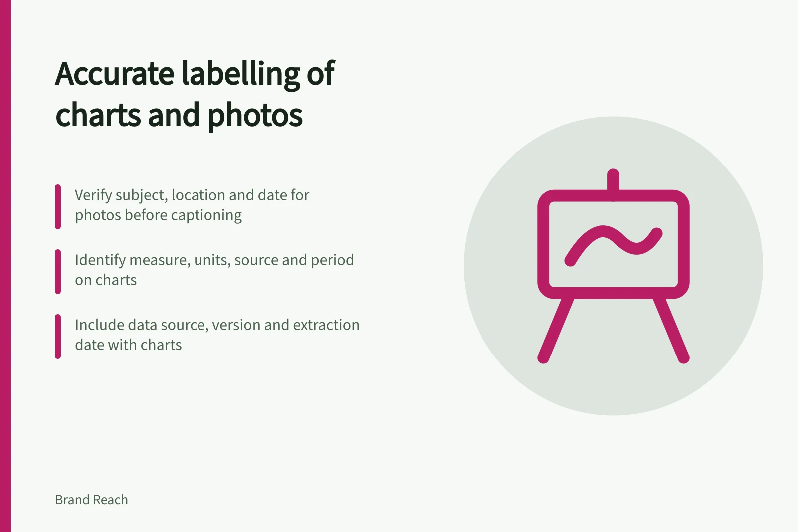
Write photo captions and chart labels that preserve dates, sources, units, context and the limits of what an image can show.
Label a press asset so that someone who sees it apart from the release can tell what it shows. For a photograph, give the verified subject, place and date when those details matter.
For a chart, identify the measure, group, period, units and source. Put a limit beside the claim it changes, where the image may be used on its own.
Photograph vs. chart: key labelling requirements
- PhotographIdentify verified subject, place and date; state if staged or illustrative; avoid unsupported claims
- ChartSpecify measure, group, period, units and source; clarify base for percentages; note data limitations
Describe the photograph
Check the image and its record before writing a caption. Confirm a person's identity before naming them and check whether naming them is appropriate. Do not infer a location or date from a file name.
Say if an image is staged, illustrative or from before the announced change. A stock scene must not be presented as an actual service user or event.
A caption can identify what is visible, add the context needed to interpret it and give the required credit. Keep unsupported outcomes out of it: a photograph of one person using a product cannot establish how it works for other users.
For an image published online, a caption and alternative text serve related purposes. The caption supplies context and attribution; alternative text conveys information to someone who cannot see the image. Write alternative text for the image's role on the page, avoiding needless repetition of a complete caption. A purely decorative image should use empty alternative text.
Essential elements for image accuracy
- Subject identity
- Confirm before naming; do not infer from file name
- Location and date
- Only include if verified and relevant
- Image type
- State if staged, illustrative or stock (not real event)
- Attribution
- Include credit for source and creator where required
Pros and cons of using alternative text with images
- ProsEnables accessibility for screen readers; conveys essential information when image is not visible
- ConsCan become redundant if overly repetitive of full caption; may mislead if used for decorative images
Make the chart's claim clear
Check that the title, axes, legend and notes tell readers what was measured. Identify whether values are counts, percentages, rates or amounts. For a percentage, make its base clear. For a comparison, confirm that the groups and periods use compatible definitions.
Place the source and relevant reference period with the chart. If the data can change, identify its extraction date or version. Explain an exclusion, rounding rule or limited sample when omitting it would change the reading. Use labels or patterns as well as colour.
For example, responses from one business's customers cannot be labelled as a finding about all Australians. A trial result cannot be labelled as an outcome for every eligible user without evidence for that wider claim.
Check the exported asset
Compare the finished image with its approved values and wording. Review plotted points, axis ranges, units, category names, dates and notes. Read its title and caption without the surrounding release: do they still give the right impression?
Compare the same claim in the fact sheet and pitch. If the data or population changes, update and identify the affected image as well as the prose.
Keep the approved caption, alternative text, source, version and owner in the asset record. For a complex chart, supply a written explanation or data table so readers do not have to rely on the image alone.